

"You put water into a cup it becomes the cup. You put water into a bottle it becomes the bottle. You put it in a teapot, it becomes the teapot."
How can we expand on responsive design to account for non-screen based interfaces such as voice, and how do we design for all of them?
I propose a new design tool that looks to aid designers in creating the overall experience over designing for a platform.
“Developing fixed-size Web pages is a fundamentally flawed practice. Not only does it result in Web pages that remain at a constant size regardless of the user’s browser size, but it fails to take advantage of the medium’s flexibility.”
James Kalback wrote in 2002
The need for responsive design came out of the growing number of devices, where mobile browsing would overtake desktop browsing. Input devices were changing from T9 keypads and mouse and keyboard to touch or game controllers and many more devices were connected to the internet.
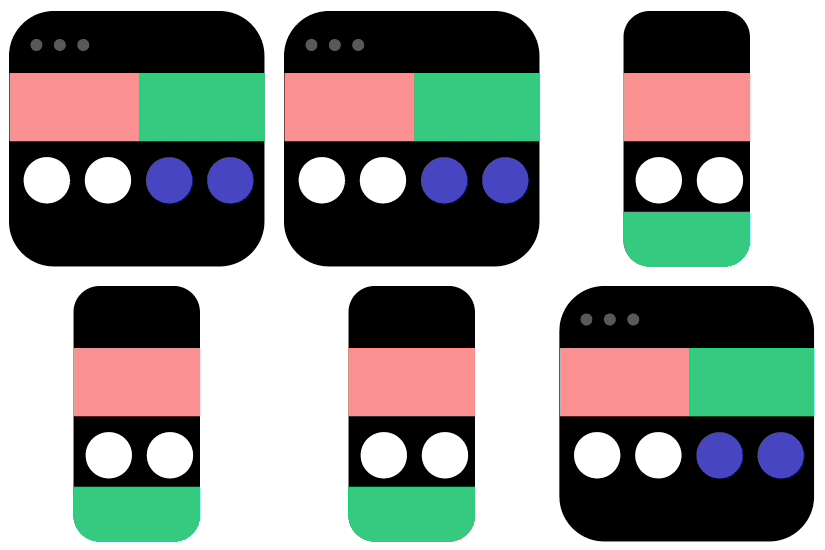
Mimicking parts of the physical world in digital experiences aids the users understanding. This is the idea of Skeuomorphism.
Many current tools allow for some form of collaboration. Fluid Design needs to acknowledge these collaboration functions and address it.
Sketch
Adobe XD
inVision Studio
Figma
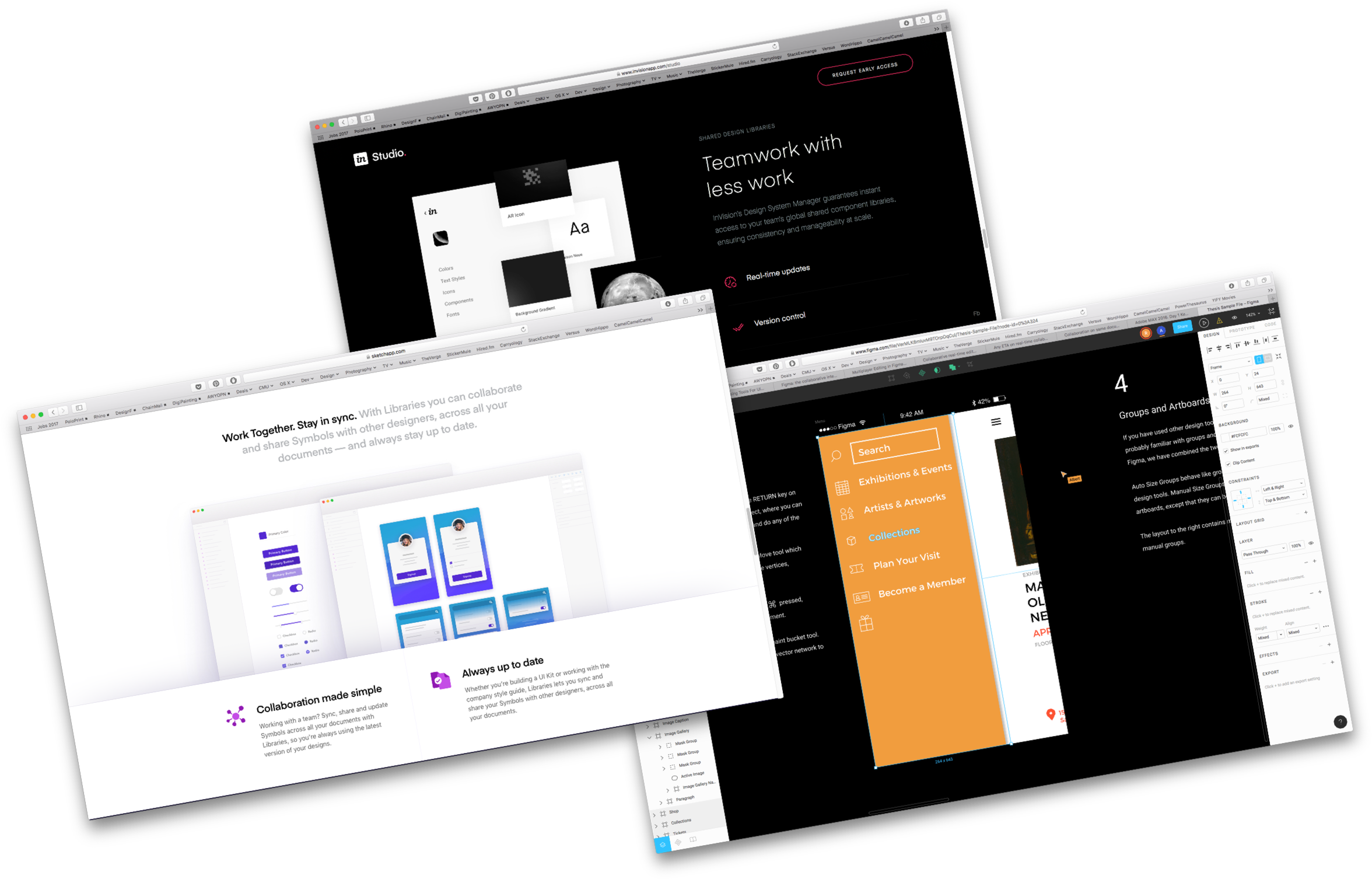
Why is real-time collaboration so important?
“We use Google Drawings to create wireframes because it allows us all to work in the same file at the same time and to instantly see changes made.” (“Collaboration on Same Document.”)
Apple's Siri
Amazon's Alexa
Google's Assistant
Dialogflow
Sayspring
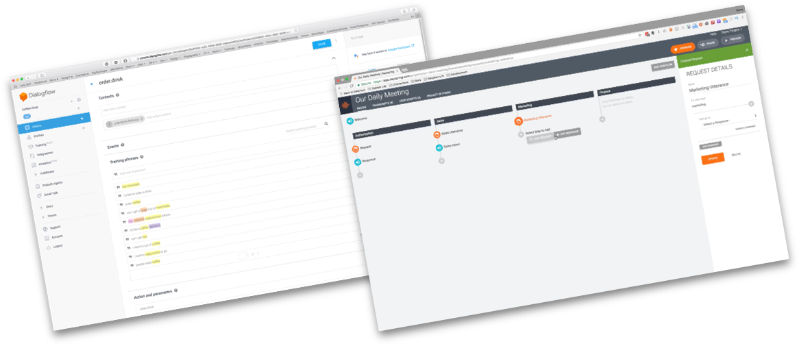
Voice frameworks set several rules to address within a voice context. Such as what voice is allowed to do on each of the platforms.
The voice tools start to break down these rules. Allowing the designer to address specific user requests and the scope of the voice application.
“I have an old climbing rope that could be labeled as 'broken'. It’s not suitable as a safety device while climbing anymore but I have woven it into a door mat” (Maestri)
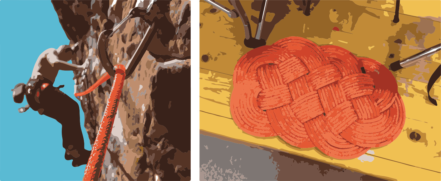
Which got me thinking…
What would be the digital equalvalent of the rope, a digital flexible material?
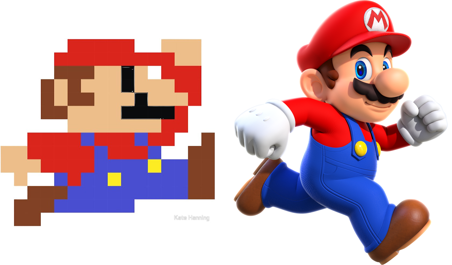
And what is the scale of this material for appropicate modularization?
Most defintions for responsive design address one consistent aspect “an interface that responds to the changing screen size”
I wanted to choose two distinct and existing platforms to use for benchmarking. I decided to use mobile and voice, leveraging a screen based interface and a voice based interface.
“[Responsive design is] always going to be a problem when we’re designing using static pixel tools instead of declaring relationships between things”.
Shouldn’t our design tools be as flexible as the platforms and environments they are deployed in?
I think so!
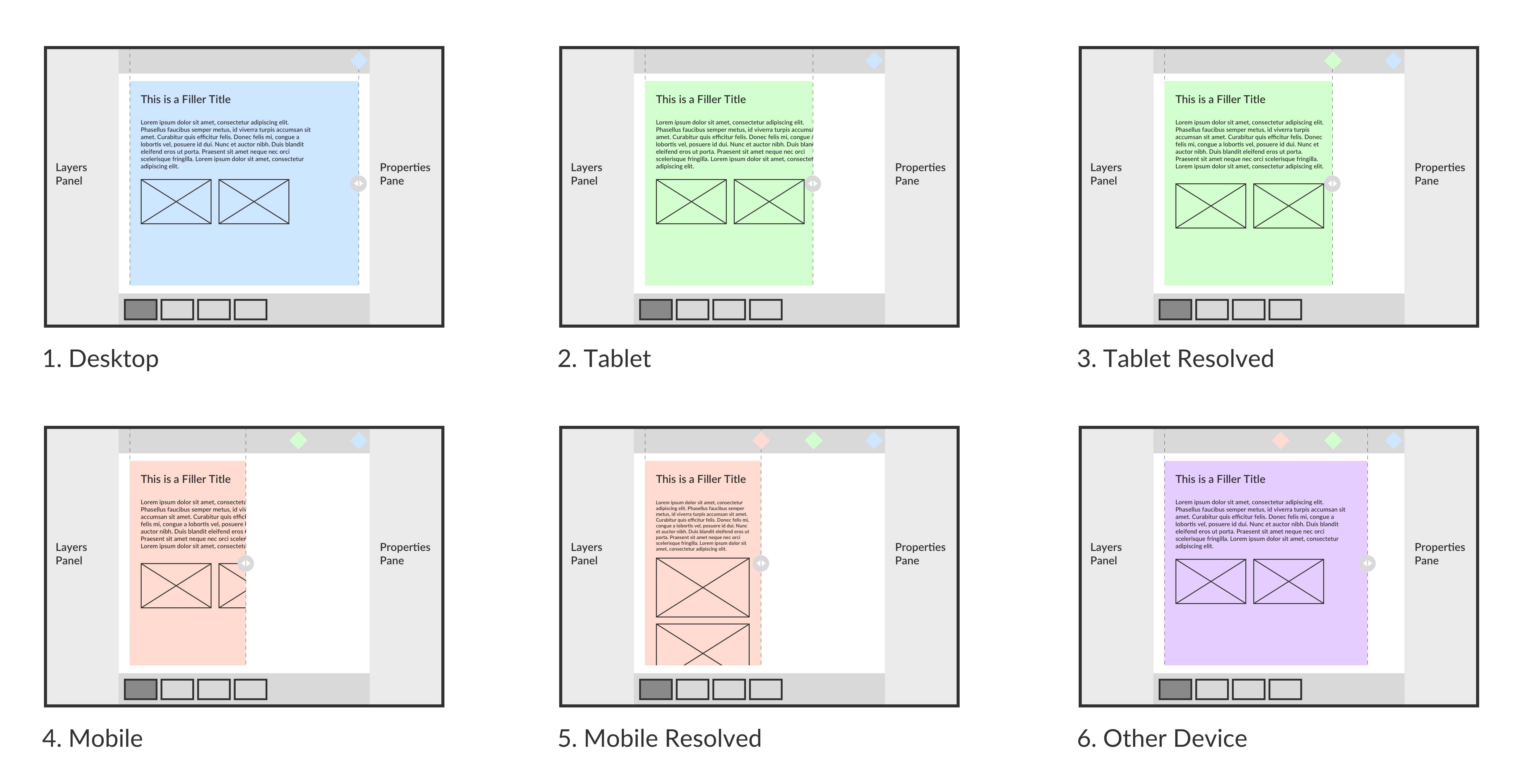
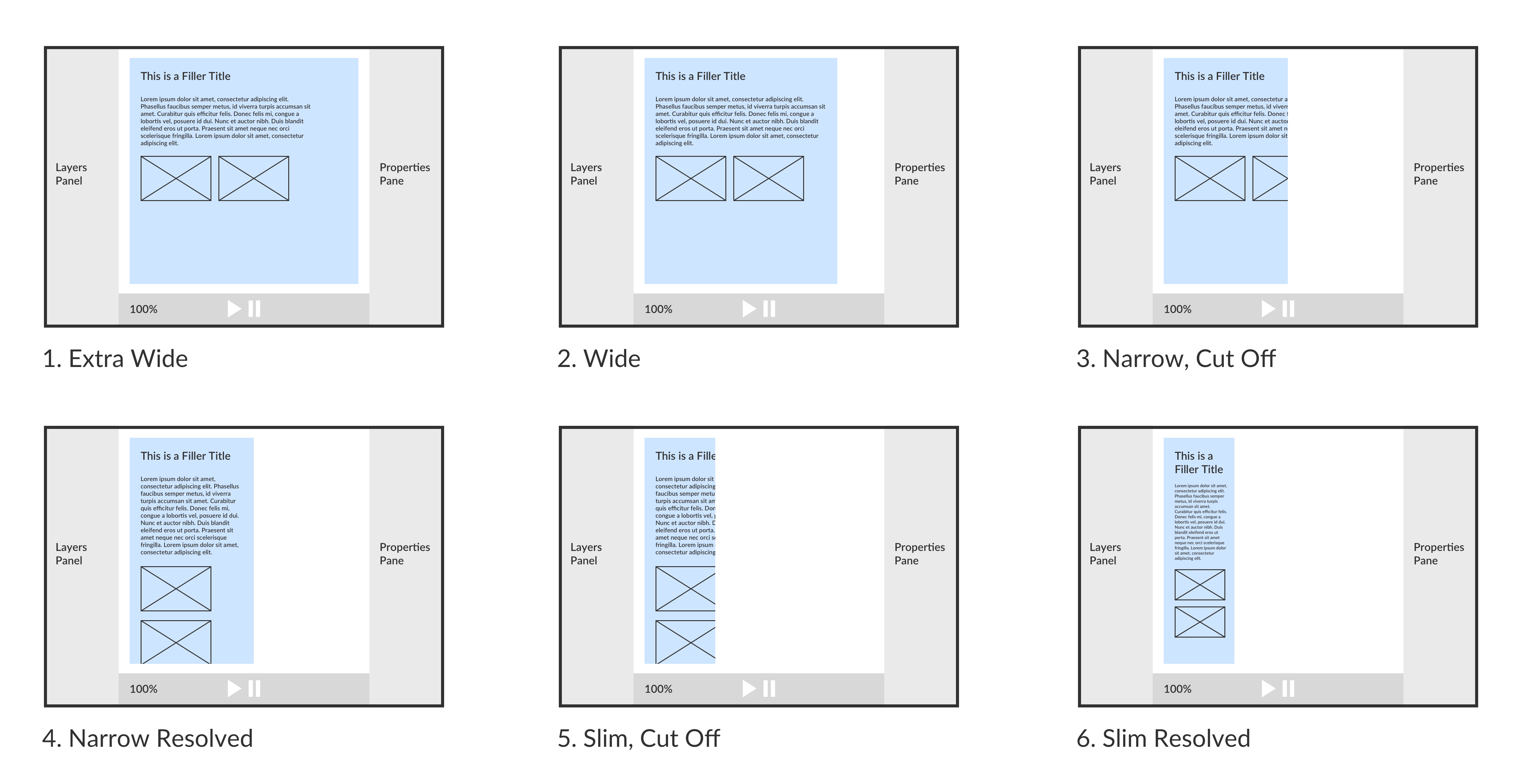

Axure RP
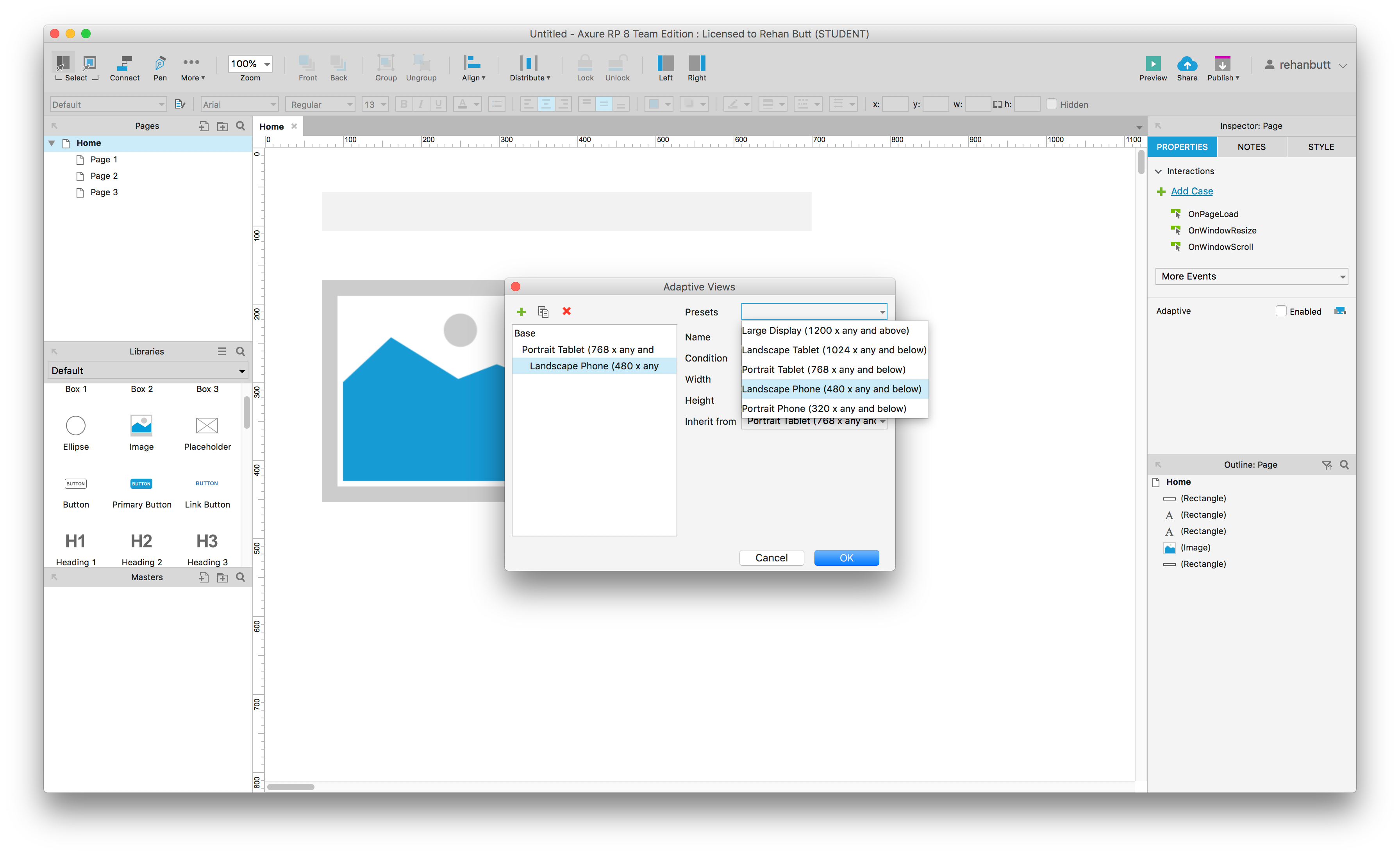
The issue with both of my prototypes is that they only take into consideration screen based interfaces and only screen size rather than more environmental considerations such as touch vs mouse and keyboard.
1Setting the stage
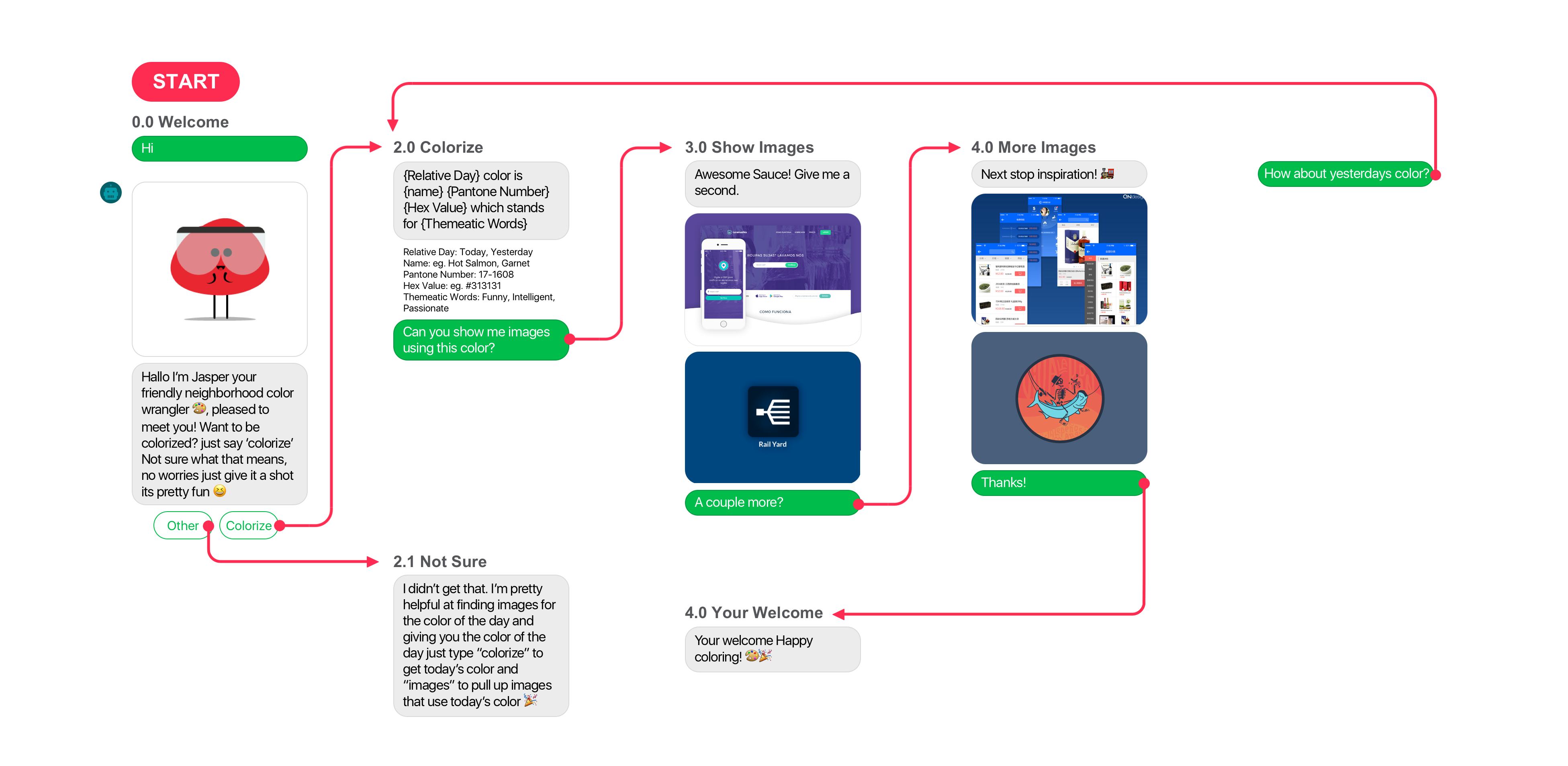
2Mobile Post-it Flow
3Voice Post-it Flow
4Fluid Post-it Flow
5Fluid Wireframe
6 Wireframe Test
7Group Discussion
8Fluid Material?
The goal of the workshop was to test how designers worked in a platform agnostic way through several exercises and to see what their takeaways were from this process.

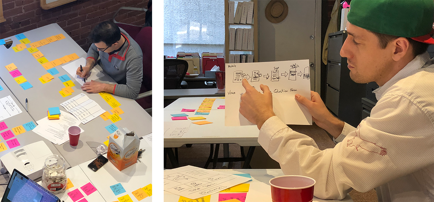
The workshop concluded with the group addressing what they thought the Fluid Material should be; a core action, an action that must exist on each platform in order to complete the experience.
Core Action
Action Stack
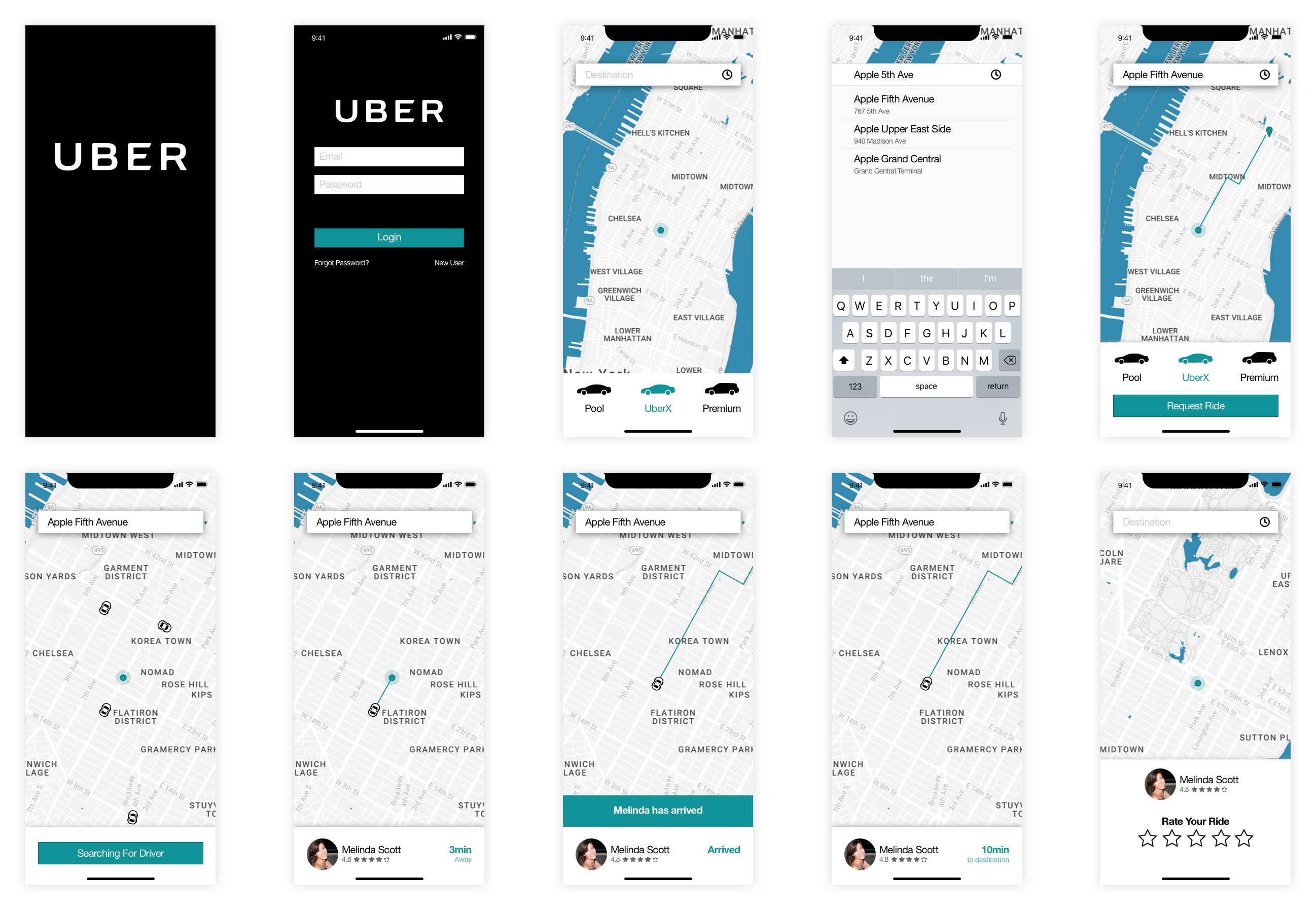
The next step was to implement the Fluid Material and the process of designing an interaction flow that is propagated to several platforms, in this case a mobile and voice platform.
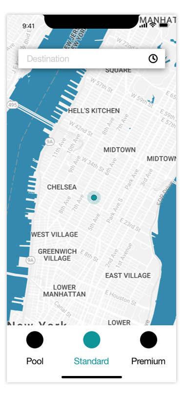
Rideshare
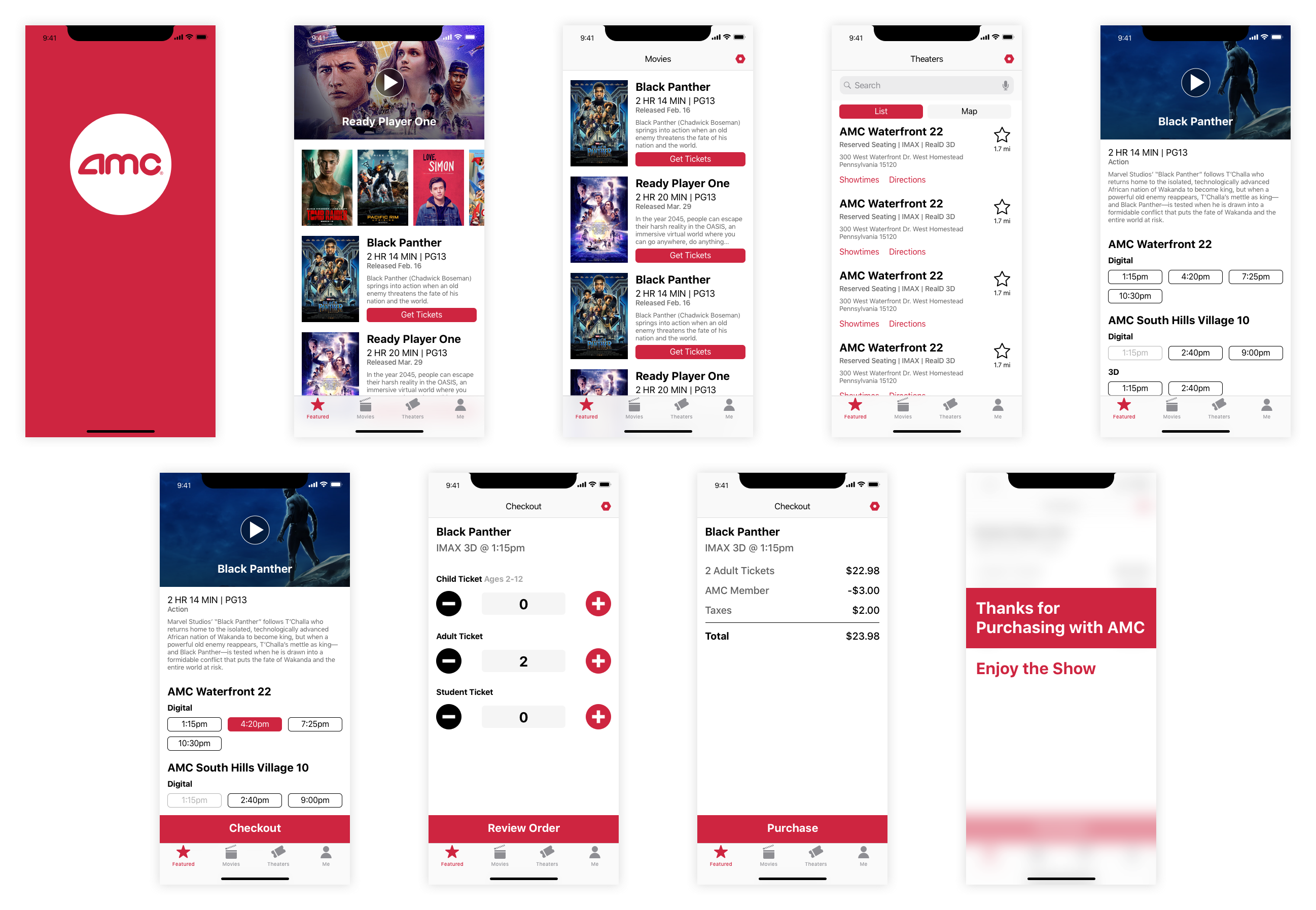
Movie Purchase
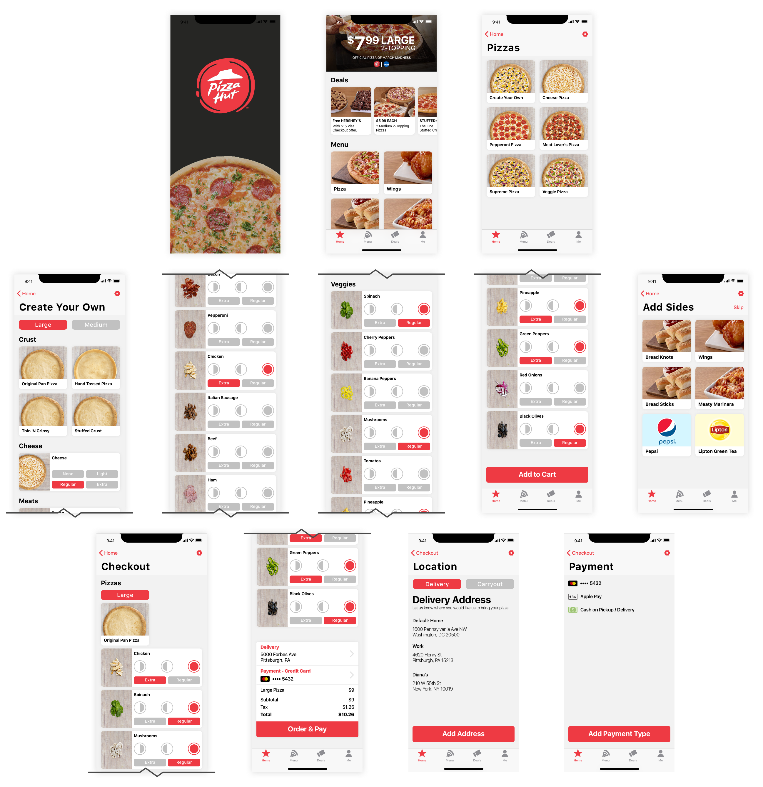
Pizza Order
I propose a new design tool that looks to aid designers in creating the overall experience over designing for a platform. Allowing designers to consider non-screen based interfaces
Action
Lights! Camera! Action! No movies here, but lots of actions. Actions make up the main interactions of your experiences.
Platform
Design for any and every platform out there. Fully connected to all the other propagations all linked to the core actions.
UI
Give all your experiences a fresh coat of paint! Whether colors and drop shadows or accents and tones.
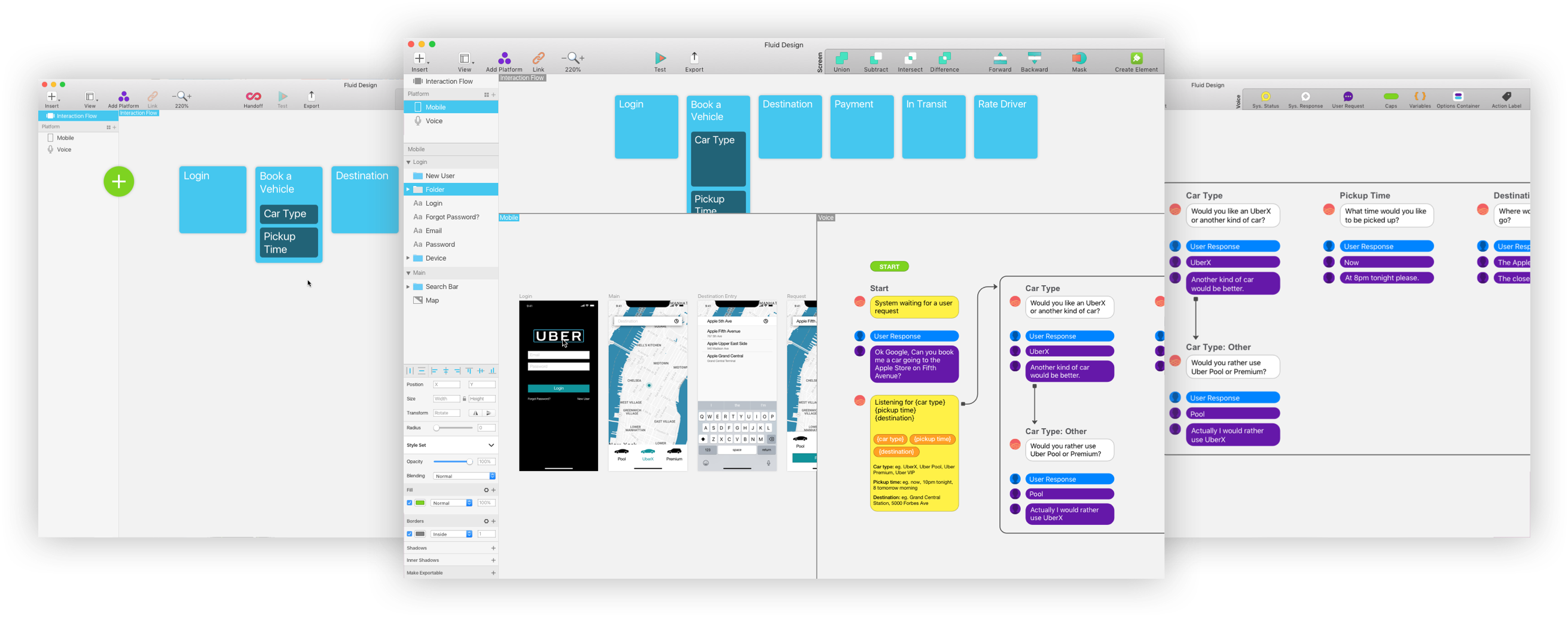
Your Design Experience Elevated.
Actions Start your Experience.
Actions build the base of your experience and help to keep functions crisp and clear.
Multi-platform Support
Propagate all your actions to any platform. Create beautiful multi-platform experiences.
Screen Design Tools
All the tools you need to craft the best application on screen. Everything to create a great visual language.
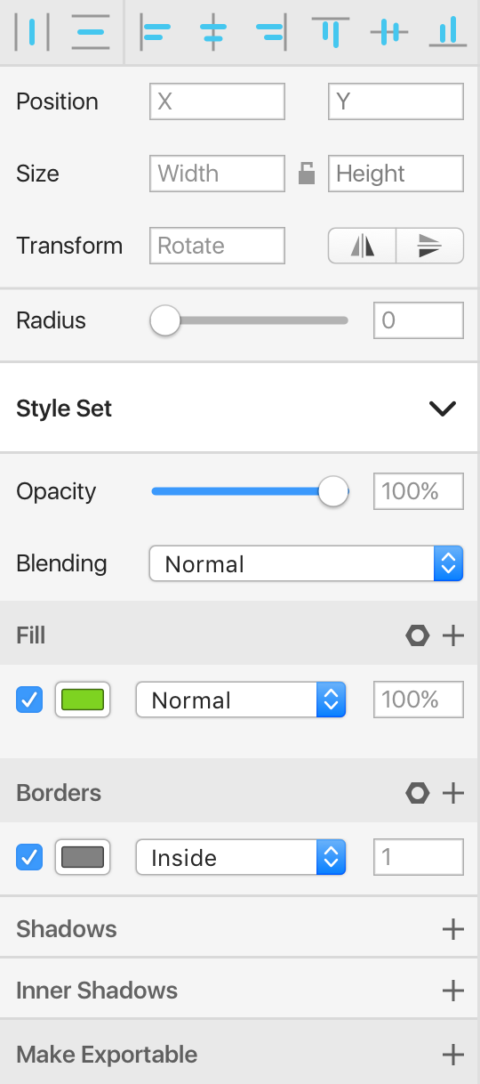
Screen Design Properties
Adjust until your hearts content with all the expected properties for any screen interface element.
Voice Design Tools
All the elements in one place to assemble the perfect voice flow. From system responses to variables to the user requests.
Want to get started with voice design in Sketch? Check out my voice design template.
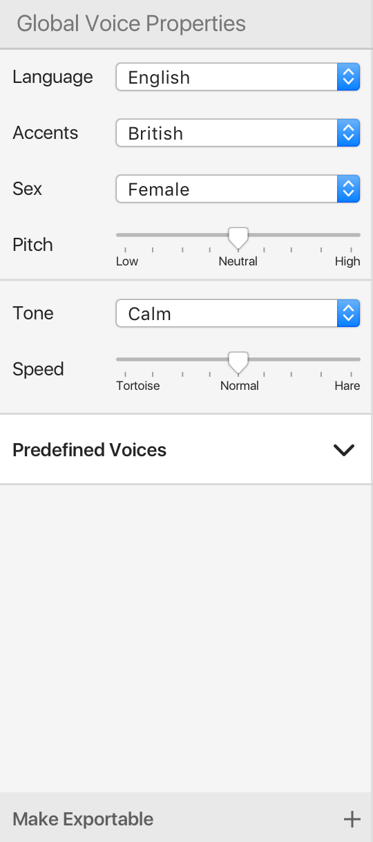
Voice Design Properties
With the voice design properties you are able to create just the right character for your application. Specify an accent or a tone really matching the mood of your users.
Form Links Between Your Designs
With the Link feature connect all your actions to their respective interations. Helping you keep track of every action on every device.
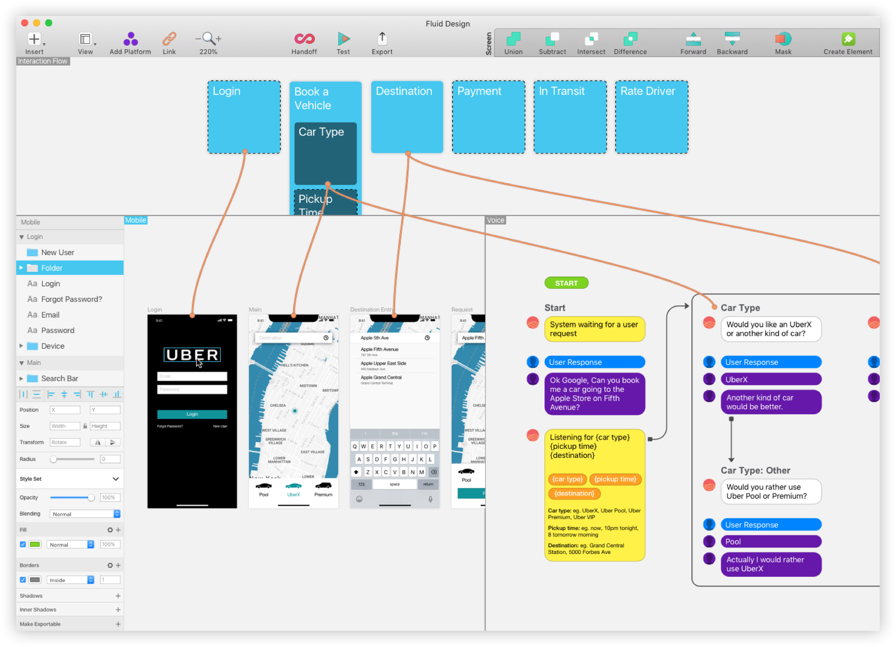
Create Seamless Experiences Regardless of Platform
With Handoff you can create experiences that bridge platforms. Helping you design for the way we live everyday. Whether on our phones, or talking to our voice assitants.
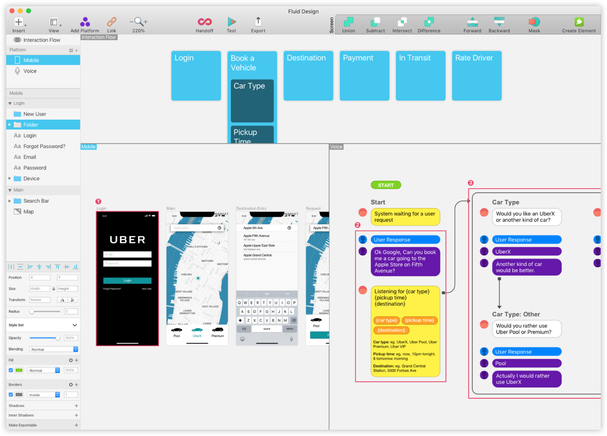
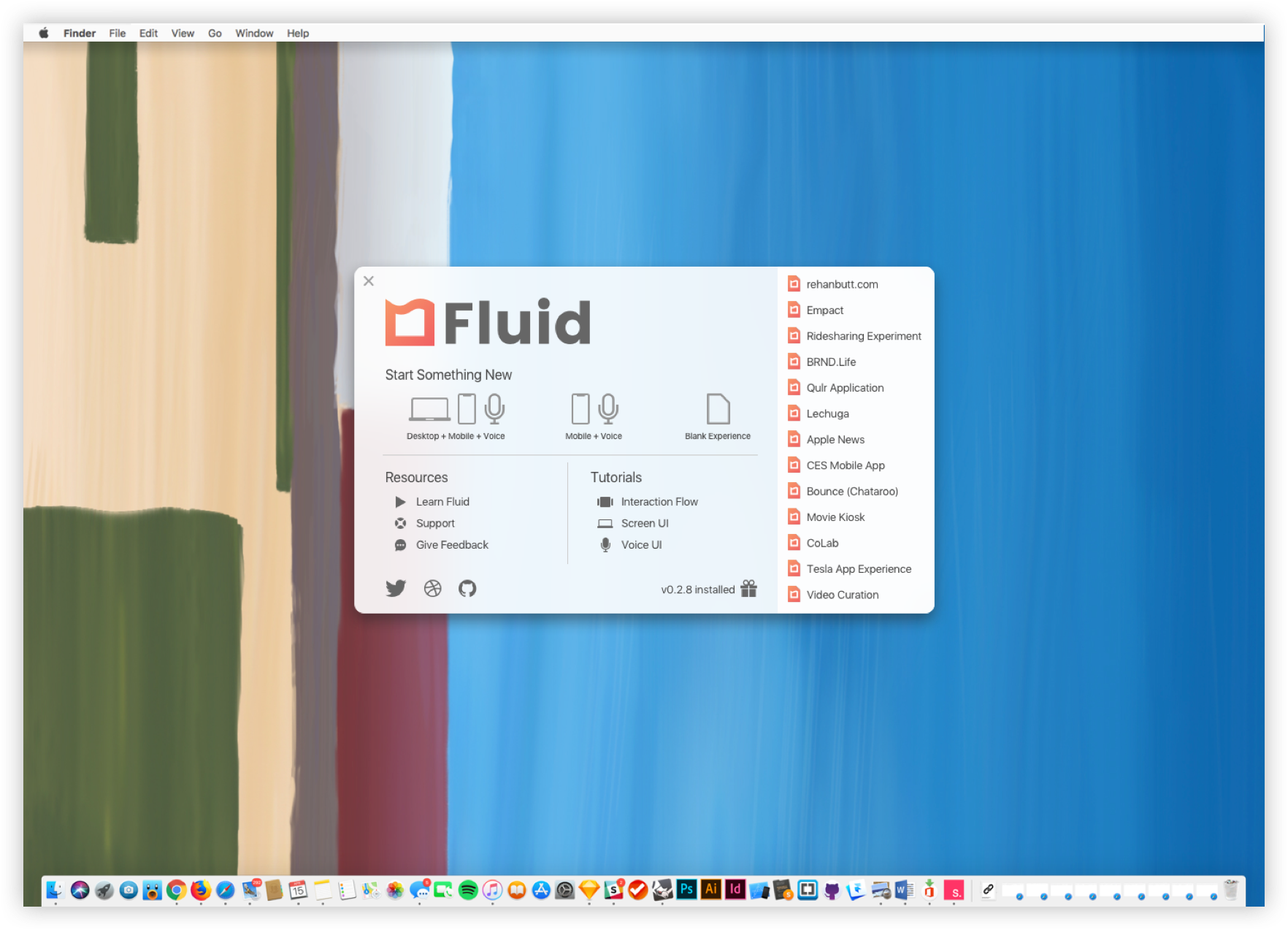
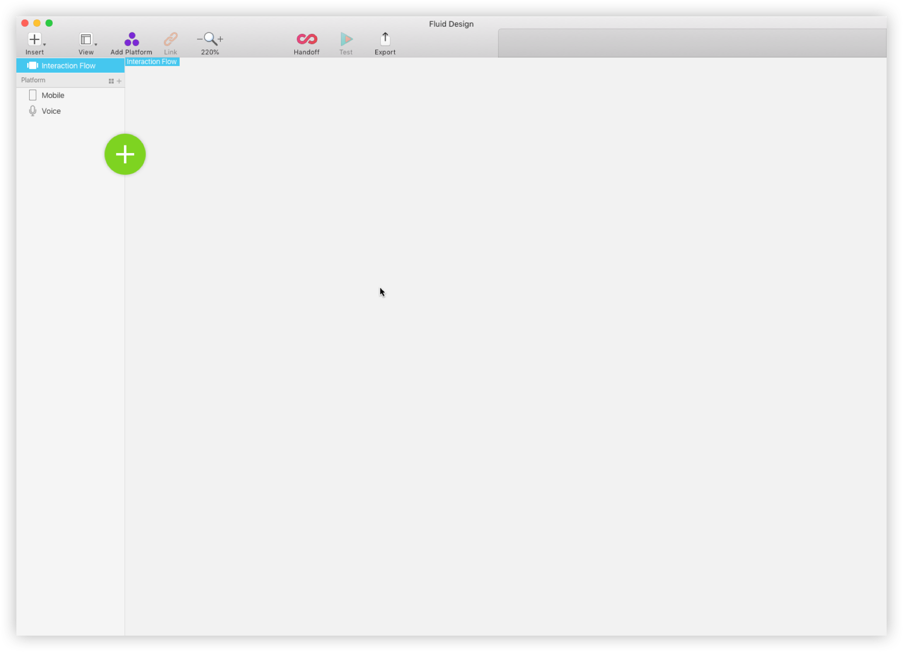
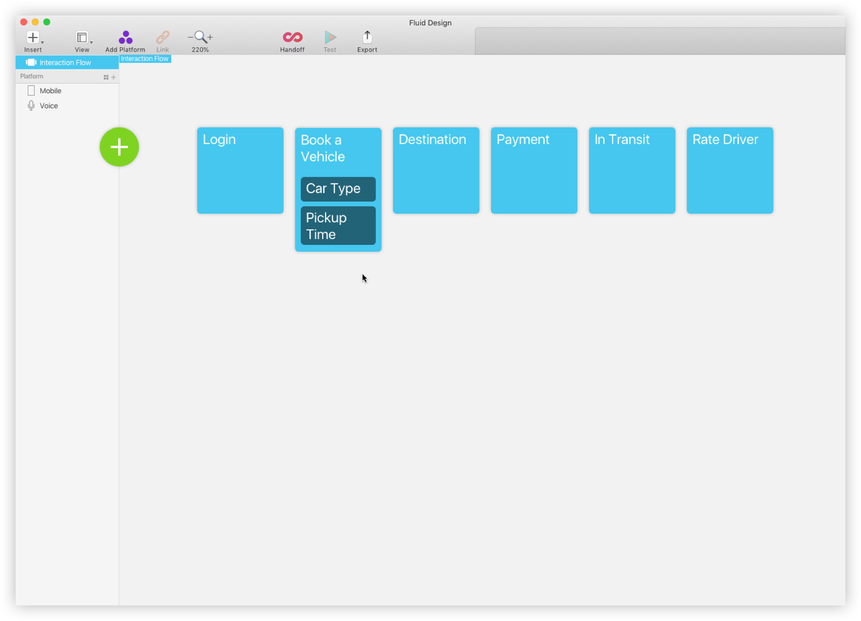
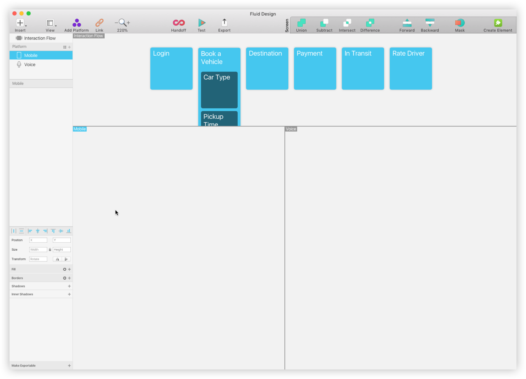
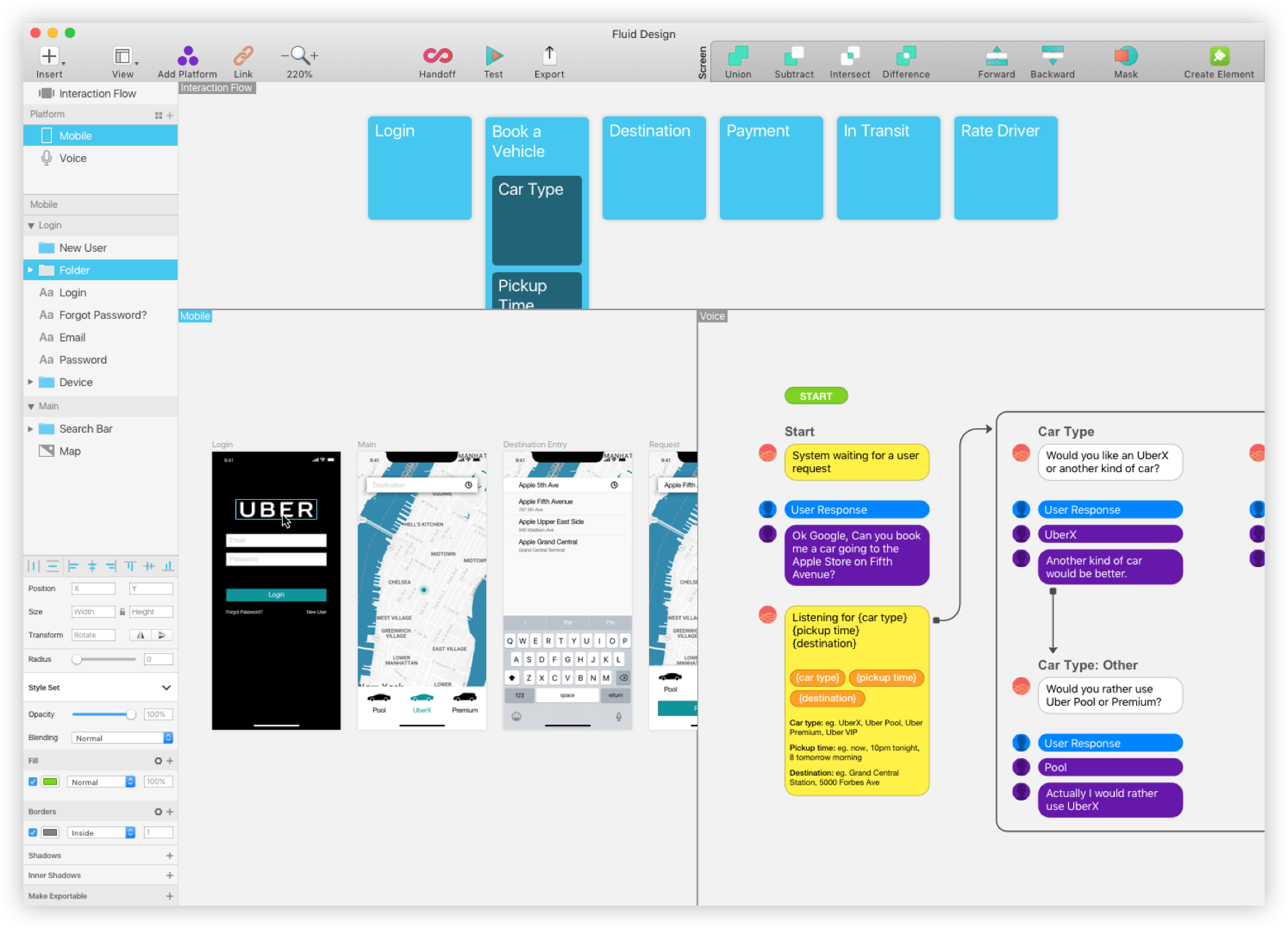
Fluid Design is helpful in designing across different platforms, but showed the limitations when designing in a platform agnostic fashion.
Not all experiences should be propagated to their fullest extent on all platforms.
It also exposes a process of updating and propagating design decisions from one level of abstraction to another and back again.
Fluid Design helps to address what the future of our design tools may look like.
Fluid Design addresses some of the questions around designing platform-agnostic experience, but could afford further study with more details and nuances for designers and their users.
Content Aware
Explore what a content aware design space would look like. Allowing designers to handle user environmental cases such as day or night modes.
Motion Design
Give designers the tools they need to animate at the object level. Allowing for high fidelity prototyping of all your screen designs.
Sound Design
Share the love of sound with your users. Sound design tools give you the power to share all kinds of sounds with your voice experiences.
Dev Handoff
Create a clean and smooth process to handoff your design to developers. Share screen and voice specifications and from wireframes to fully rendered applications.
Future Platform Test
Test out future platforms with Fluid Design. Ensuring that all the necessary tools are in place for the designing the best possible experiences.